
LO1
First thing i did is Research what brand guide is (How To Create Brand Guidelines: Simple Brand Guide Template (2025) - Shopify) and after having a good idea about it i started looking for inspiration on multiple websites and pinterest. (StyleScape & Moodboard :: Behance, 28 Brand Guidelines Examples to Inspire Your Brand Guide | Looka) After feeling really inspired i took some things i really liked and adapted them into my Brand guide and design concept which was keep it simple but also fun
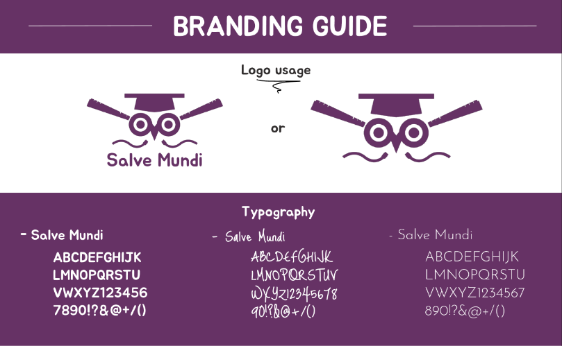
Logo
I decided to change the font under the logo because in my opinion its more cohesive and i found that the other font looked a bit too chunky and round.
For the logo using it with the text under and without the text looked best in my opinion.
Typography
For the fonts i chose 3 essential for the idea i was going for. I choose the one that i used for the logo and it can be used at headers because i think it goes really well with the slim and profesional font i choose for writing paragraphs. To keep the fun aspect i choose a 3rd font thats a little playfull and can be used under images, etc.
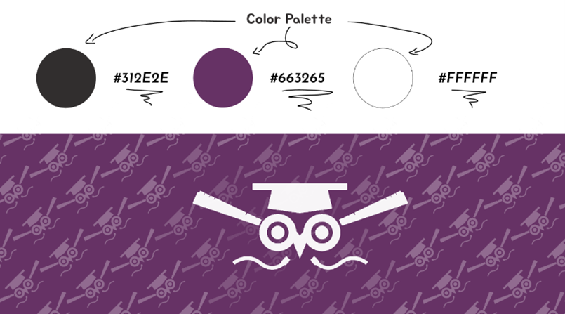
Color Palette
Since i wanted to keep it simple i choose to go with black and white to contribute with the purple and make it look cleaner. I was considering electric blue but in the end i ended up not going with it.
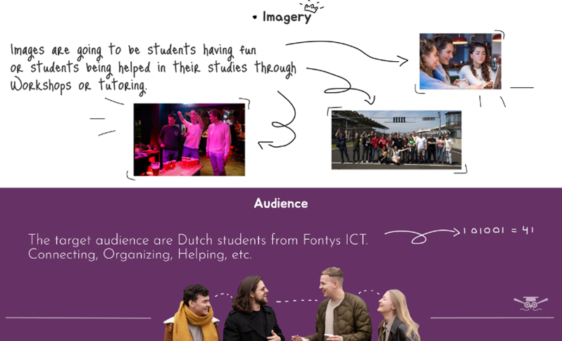
Imagery
For the images i think all of them should be related to the activities, tutoring and workshops. To keep it playfull and fun to look at i thought that incorporating some doodles would help and it fits well with the writing font.
Audience
For the audience (fontys ICT students), they wanted something simple, usable and straight forward. Not ugly or mobile friendly.
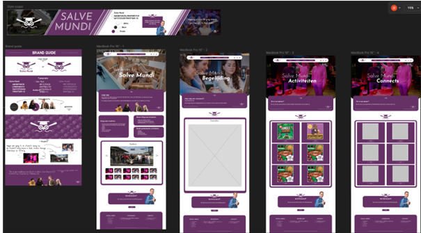
For the website i used the data from the research/interviews. I also first went on pinterest and looked for some inspiration for the website prototype.
After also doing some research and interviewing. I came up with a design for the website. Focusing on simplicity but also making it bright and fun to look at, and still as student-like as possible.
Link to figma: Salve Mundi
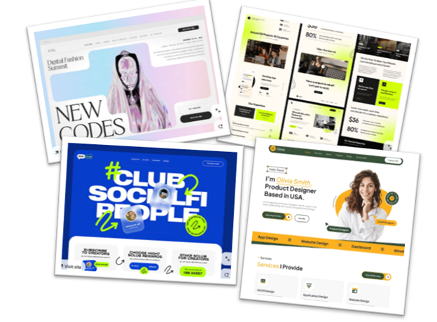
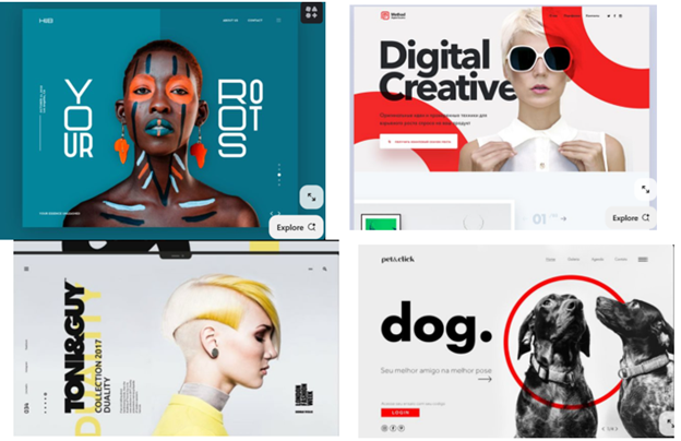
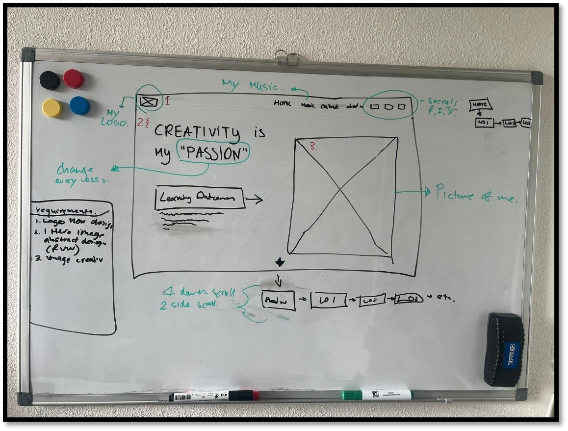
Before starting on the design itself i looked for inspiration on pinterest and got a couple, i wanted to start prototyping the website on a white board and clearly have a view of my ideas.
I also remembered that i made myself a logo (1. In whiteboard picture) a long time ago and i wanted to also work on that and make it better and improved so i can use for my music, my portfolio website and for any other future projects that i might have.
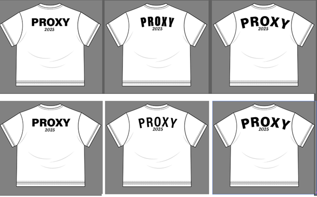
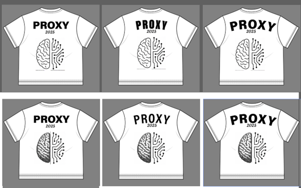
There was a challenge for making a shirt for proxy and i decided to participate and i came up with these.