

LO4
I have invested in and started using the adobe creative tools to be able to a make designs at a profesional standard. I already have a lot of experience with designing because i used to make designs for different e-sports and casual teams.
i will have to refresh myself on everything again because it has been a while since i have used the adobe creative tools.


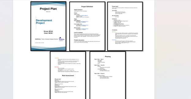
I helped my team make a Project plan for the development phase. When we were finish writing everything i decided to look deeper and also work on the design and look of the Project Plan.
I wanted it to look more profesional. So i made the “voorblad” look better and also the content of the project plan, instead of having it fully not bold or normal. I made it in some places BOLD and in some places normal, and it came out looking very nice. I also added the idea to color code the MoScOw.
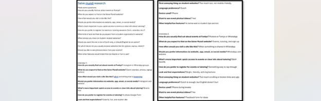
I made a couple questions to be able to interview and get some research information. I could not go as deep as i wanted to because i wanted to finish everything ASAP. I only got the information i needed in 2 interviews.
After doing these interviews i have a better view on what is needed to make the page as good as possible.
I have made a project plan for my sprint x that involves making a website for a Company called aggregate. By making this project plan i can clearly see what i need to do and what i dont. It has really made me lay down everything so i can get started. .
To manage the development of Aggregate’s website efficiently, I created a planning structure and broke the project down into smaller, manageable tasks. I made to-do lists that covered everything that needed to be done. This helped me stay organized and track my progress.

To build a website that truly represents Aggregate, I’ve maintained regular communication with the company’s owner. We’ve had several checkin calls where I present the current version of the site and get live feedback and discussing opinions. This way I could make improvements and align the design closer to what they want and keeping it professional. .
I also asked for files, like company documents, service descriptions, etc. to me write accurate content and understand them better.
These ongoing conversations have been essential for keeping the project on track and making sure the website is both professional and aligned with the company.

To ensure I design a professional and effective website for Aggregate, I began by researching how top accountancy firms structure and present their websites. I looked at industry leaders like PwC, Deloitte, and KPMG for my research to identify common patterns and design choices.
What stood out across all these websites were their clean, minimalistic layouts. often with white backgrounds and brand-specific accent colors (red for PwC, green for Deloitte, blue for KPMG). Their typography was consistent and modern, using sans-serif fonts like Helvetica or Open Sans. Whitespace played a major role in giving the content clarity and I remembered what Jo-an told me when we were reviewing my salvemundi prototype when I asked if I had too much whitespace.
From a UX perspective, I noticed a strong focus on accessibility, like high contrast, alt text for images, and mobile responsiveness. Content was easy to read, often broken into chunks with bold subheadings to guide users through the page.
All of this research is helping me shape Aggregate’s website to look professional, trustworthy, and aligned with industry standards. I'm using this research to make decisions and deliver a site that not only looks great but also works for the users.